Responsive Design Demystified: Building Websites for All Devices

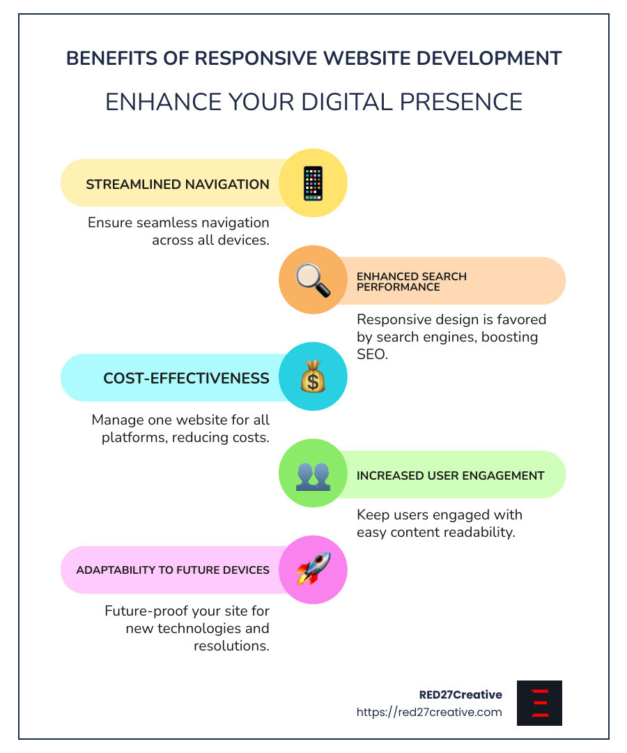
Responsive website development ensures that your website looks and works well on all devices, from phones to tablets to desktops. In today’s fast-evolving digital landscape, having a website that adapts seamlessly to any screen size isn’t just a luxury—it’s a necessity. Here’s why:
- One Website, Every Device: A responsive site adjusts to fit screens of all sizes, offering a consistent user experience.
- SEO-Friendly: Search engines favor responsive designs, potentially boosting your site in search results.
- Cost-Efficient: Manage a single site rather than multiple versions for desktop and mobile.
- Improved User Experience: Easy navigation and content readability on any device keeps visitors engaged.
- Future-Proof: Responsive design adapts to new devices and resolutions, saving you time and effort in the long run.
By using the power of responsive web design, you ensure that your online presence remains versatile and accessible, regardless of the device your audience chooses. Bridging the gap between form and function, responsive design triumphantly transcends the traditional limitations of single-device web development, paving the way for a future-proof digital strategy.
I’m Kiel Tredrea, and with over 20 years in branding and digital innovation, I’ve mastered the art of responsive website development. My journey in web design and development has led to creating seamless, adaptive websites that meet the needs of diverse audiences while driving measurable results.
Responsive website development terms to remember:
– web design and development services
– website design and development packages
Understanding Responsive Website Development
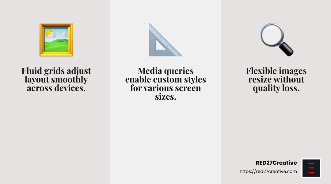
Responsive website development is like crafting a magical shape-shifter—your website becomes adaptable, adjusting its form to fit any screen size. This is achieved through three key elements: fluid grids, flexible images, and media queries.
Fluid Grids
Imagine your website as a flexible canvas that stretches and shrinks as needed. Fluid grids are the backbone of this adaptability. Instead of using fixed-width layouts, fluid grids employ relative measurements like percentages. This ensures that your website’s layout changes smoothly as the screen size changes.
For example, if a column in your layout is set to 50% width, it will always take up half the screen—whether it’s a smartphone or a widescreen monitor. This approach keeps your content organized and visually appealing.
Flexible Images
Images can be tricky. They need to look good on all devices without slowing down your site. Flexible images solve this dilemma. By setting the max-width property to 100%, images scale down with their containers but never exceed their natural size. This prevents images from becoming pixelated or overflowing their space.
For instance, if an image’s container narrows, the image shrinks to fit. But if the container expands, the image stays sharp and clear, never stretching beyond its original dimensions.
Media Queries
Media queries are like the secret sauce that makes everything come together. They allow you to apply different styles for different screen sizes. This means you can tweak your design at specific breakpoints, ensuring that your site looks great on every device.
Here’s a simple example of a media query:
css

@media screen and (min-width: 80rem) {

  .container {

    margin: 1em 2em;

  }

}
In this snippet, the styles within the media query apply only when the screen width is at least 80 rems. This lets you create a single-column layout for mobile devices and switch to a multi-column layout when there’s more screen space.
By weaving together fluid grids, flexible images, and media queries, responsive website development ensures your site is not only visually appealing but also functional and user-friendly on any device. This harmonious blend of design and technology guarantees that your website remains accessible and effective, no matter how the digital landscape evolves.
Next, we’ll dive into the Key Elements of Responsive Design, exploring how content strategy, viewport meta tags, and responsive typography play crucial roles in crafting a seamless user experience.
Key Elements of Responsive Design
Responsive design is more than just a technical endeavor—it’s a strategic approach to ensure your website looks and works great on any device. Let’s explore some key elements that make this possible: content strategy, the viewport meta tag, and responsive typography.
Content Strategy
In responsive design, content is king. A well-thought-out content strategy ensures that your website delivers the right message, regardless of the device. This involves prioritizing content based on user needs and device constraints.
For example, on a mobile device, users might be looking for quick information or contact details. Therefore, critical content should be front and center, while secondary details can be tucked away. This approach not only improves user experience but also helps in achieving business goals.
Viewport Meta Tag
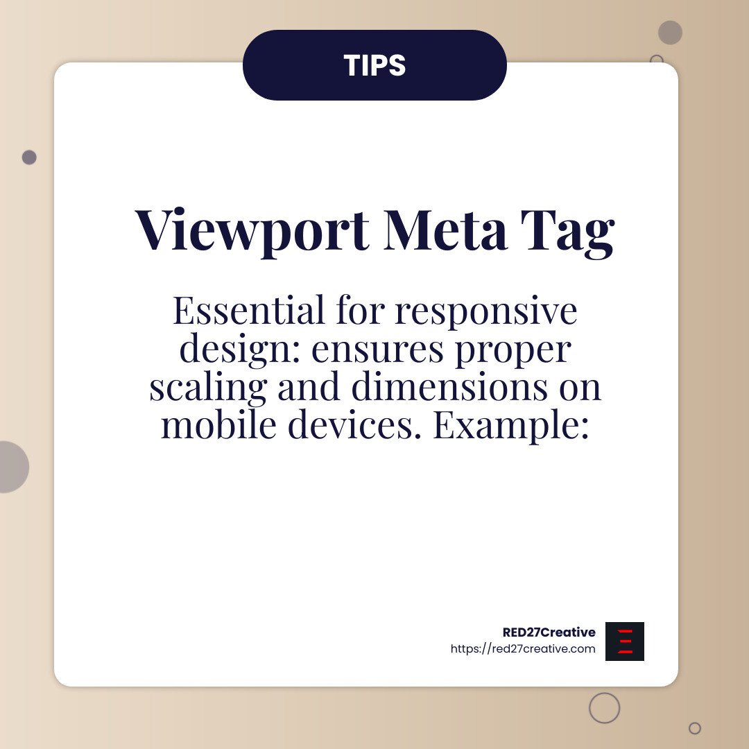
The viewport meta tag is like the unsung hero of responsive design. It tells browsers how to control the page’s dimensions and scaling on different devices. Without this tag, your responsive efforts might fall flat.
Here’s a typical viewport meta tag:
html

<meta name="viewport" content="width=device-width, initial-scale=1">
This snippet sets the viewport to match the device’s width and ensures the page scales correctly. It’s a small line of code, but it has a big impact on how your site is displayed on mobile devices.
Responsive Typography
Typography plays a vital role in readability and aesthetics. Responsive typography uses scalable units like em or rem to ensure text adjusts smoothly across devices.
Consider this CSS example:
css

h1 {

  font-size: calc(1.5rem + 4vw);

}
This code ensures that the font size grows with the viewport width, maintaining readability on both small and large screens. By using responsive typography, you improve user experience by making sure your content is always easy to read.
By integrating a solid content strategy, the essential viewport meta tag, and adaptive typography, you lay the groundwork for a responsive design that caters to users on any device. These elements work together to create a seamless and engaging experience, ensuring your website is both functional and visually appealing.
Next, we’ll explore Techniques for Building Responsive Websites, where we’ll dig into fluid proportion-based grids, CSS3 media queries, and flexible images.
Techniques for Building Responsive Websites
When it comes to responsive website development, there are a few key techniques that can make your site look amazing on any device. Let’s break down the essentials: fluid proportion-based grids, CSS3 media queries, and flexible images.
Fluid Proportion-Based Grids
Imagine your website layout as a liquid that fills any container it’s placed in. That’s the idea behind fluid proportion-based grids. Unlike fixed grids that use rigid pixel measurements, fluid grids use percentages to size elements. This allows your layout to adapt seamlessly to different screen sizes.
Here’s a simple example:
“`css
.container {
width: 100%;
max-width: 1200px;
margin: 0 auto;
}
.column {
float: left;
width: 33.33%;
padding: 10px;
}
“`
In this setup, the container spans the entire width of the screen but doesn’t exceed 1200 pixels. Each column takes up a third of the container’s width, ensuring a balanced look no matter the device.
CSS3 Media Queries
CSS3 media queries are like magic spells that change your website’s appearance based on the device’s characteristics, like its width or resolution. They let you create different styles for different devices without altering your HTML.
Here’s a basic media query example:
css

@media (max-width: 768px) {

  .column {

    width: 100%;

  }

}
This snippet tells the browser to make each column full-width if the screen is 768 pixels or narrower, perfect for tablets and smaller devices. Media queries are your best friend when it comes to making a site adaptable and user-friendly.
Flexible Images
Images are a crucial part of any website, but they can be tricky when it comes to responsiveness. Flexible images adjust to fit their containers without losing quality or causing layout issues. This is done using CSS properties like max-width.
Consider this CSS rule:
css

img {

  max-width: 100%;

  height: auto;

}
This ensures that images scale down to fit the width of their container but never exceed their original size. It keeps your visuals crisp and prevents them from breaking the layout on smaller screens.
By mastering fluid proportion-based grids, CSS3 media queries, and flexible images, you can create websites that look great and function well on any device. These techniques are the backbone of responsive design, ensuring that your site is both adaptable and visually appealing.
Next, we’ll dive into Responsive Layout Technologies, where we’ll explore how tools like Flexbox and CSS Grid make building responsive layouts even easier.
Responsive Layout Technologies
When it comes to responsive website development, utilizing modern layout technologies can make your job much easier. Two of the most powerful tools in this area are Flexbox and CSS Grid. Let’s break them down.
Flexbox
Flexbox is like a magic box for arranging items within a container. It allows items to grow, shrink, and distribute space based on the available area. This flexibility makes it perfect for responsive designs.
Here’s a simple example:
“`css
.container {
display: flex;
justify-content: space-between;
}
.item {
flex: 1;
margin: 5px;
}
“`
In this setup, each item inside the container will automatically adjust its size to fit the space, ensuring a balanced look across different devices. Flexbox is great for creating one-dimensional layouts, such as navigation bars or columns.
CSS Grid
While Flexbox is excellent for one-dimensional layouts, CSS Grid shines in two-dimensional layouts. It allows you to create complex grid structures on the web, much like tables but with more flexibility and control.
Here’s how it works:
“`css
.grid-container {
display: grid;
grid-template-columns: repeat(3, 1fr);
grid-gap: 10px;
}
.grid-item {
padding: 20px;
background-color: #f0f0f0;
}
“`
In this example, the grid container is divided into three equal columns, and each grid item automatically fits into the grid. CSS Grid is powerful for creating layouts that need to adapt to various screen sizes while maintaining a structured appearance.
Flexible Grids
Both Flexbox and CSS Grid contribute to the concept of flexible grids. These grids aren’t fixed in size; they adjust based on the screen’s width and height. This flexibility is crucial for responsive design, ensuring that content looks good on everything from tiny smartphones to large desktop monitors.
Using these technologies, you can create layouts that automatically adapt to different devices without the need for countless media queries. They provide a more intuitive way to design responsive websites, reducing complexity and improving maintainability.
By leveraging Flexbox, CSS Grid, and flexible grids, you can build dynamic, responsive layouts that work across all devices. These tools are essential for modern web design, allowing you to create visually appealing and functional websites with ease.
Next, we’ll tackle some Frequently Asked Questions about Responsive Website Development, addressing common queries and misconceptions.
Frequently Asked Questions about Responsive Website Development
What is responsive web development?
Responsive web development is all about creating websites that look and function well on any device, whether it’s a smartphone, tablet, or desktop. This approach ensures that your website automatically adjusts its layout and design based on the screen size and orientation of the device being used.
Imagine visiting a site on your phone and everything fits perfectly without having to zoom in or scroll sideways. That’s responsive design at work!
How do I turn my website into responsive?
To make your website responsive, you’ll need to use a combination of techniques:
-
Fluid Grid: Start with a fluid grid layout, which uses relative units like percentages instead of fixed units like pixels. This allows your layout to adjust smoothly to different screen sizes.
-
Responsive Breakpoints: Implement responsive breakpoints using CSS media queries. These breakpoints define specific styles for different device sizes, ensuring that your design adapts seamlessly.
-
Flexible Images: Use flexible images that scale with the screen size. This can be achieved with CSS properties like
max-width: 100%, which ensures images don’t overflow their containers. -
Test on Real Devices: Finally, always test your site on various devices to ensure everything looks and works as expected. Tools like BrowserStack can help you simulate different device environments.
Is responsive design UX or UI?
Responsive design is a bit of both UX (User Experience) and UI (User Interface).
-
UX Designers focus on how users interact with a website. They ensure that the experience is smooth and intuitive, regardless of the device. A responsive design is crucial for providing a consistent experience.
-
UI Designers, on the other hand, concentrate on the look and feel of the site. They use tools like fluid grids and responsive breakpoints to create designs that are visually appealing on all devices.
Responsive design is a collaborative effort between UX and UI, ensuring websites are both functional and attractive across various platforms.
By understanding these core principles of responsive website development, you can create websites that meet the needs of today’s multi-device users.
Next, we’ll explore how RED27Creative can help you build a responsive website that stands out in the digital landscape.
Conclusion
At RED27Creative, we understand that a strong online presence is crucial in today’s digital marketing industry. Whether you’re looking to dominate local markets or expand internationally, our comprehensive services are designed to help your business grow and thrive.
Responsive website development is a key part of our approach. As we’ve explored, creating a website that works seamlessly across all devices is essential. It ensures that your audience has a smooth experience, whether they’re on a smartphone, tablet, or desktop. This not only improves user satisfaction but also boosts your search engine rankings, as Google favors mobile-friendly sites.
Our team specializes in crafting visually stunning, user-friendly websites that adapt effortlessly to any screen size. We employ advanced techniques like fluid grids, CSS3 media queries, and flexible images to ensure your site is both beautiful and functional.
But we don’t stop there. Our suite of services includes everything from SEO and lead generation to visual media and content creation. This holistic approach ensures that every aspect of your online presence is optimized for success.
If you’re ready to lift your brand and drive growth, explore our website design and development services at RED27Creative. Let’s build a responsive website that sets you apart in the competitive digital landscape.

Kiel Tredrea
https://red27creative.comTop Marketing Agency • Web, SEO & Leads • RED27Creative